At a High Level
From the data we collected, we first did some high level exploratory analysis.
First we ranked each of the 25 news organizations in terms of social media metrics. The table is produced below.
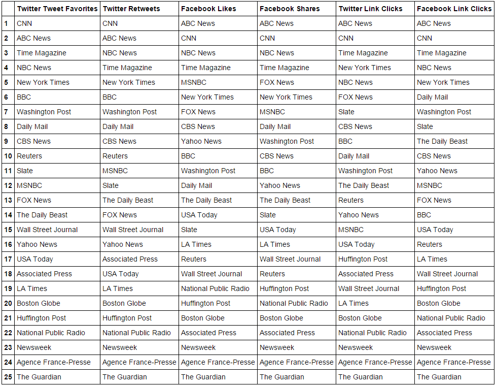
One of the most important sources of variation in the data is the news provider itself. Certain providers tend to dominate the rankings in every category: CNN, NBC News and ABC News never fall below the fifth position in any of the ranking dimensions. To a lesser extent, we see Huffington Post ranks among the top five in four dimensions while Fox News and Time Magazine ranks among the top five in three dimensions. In contrast, Newsweek, the Associated Press and the Agence France-Presse stay in the bottom five positions across all dimensions. More detailed analysis of the data reveals important tendencies that are not reflected by a summary-level ranking.
Next we plot boxplots of each of the social media metrics to understand their distributions. From the boxplot below, we see that the distribution of story popularity is strongly skewed. In practice, it means that several major stories comprise a significant amount of popularity, with the upper bounds rising as high as, for example, thirty times above the third quartile for Facebook likes of The Daily Beast stories. Reliance on several hit stories seems to be more important for small or new organizations, as the number of Facebook likes for the most popular BBC News Facebook postings is only three times larger than the third quartile value.
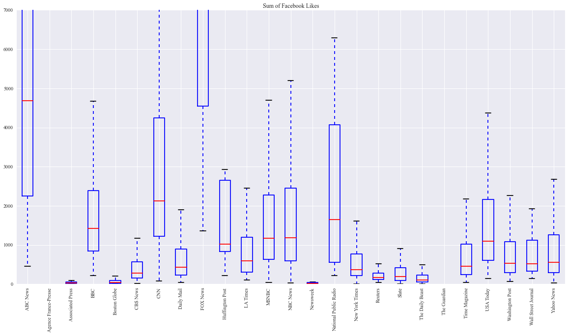
Another interesting layer of information is gleaned by comparing numbers of Facebook link clicks, likes and shares for the stories of the same news providers. An intuitive hypothesis that sharing a story reflects more reader involvement than barely liking it appears to be correct – medians of shares are constantly lower for all providers. Furthermore, the proportion of “sharers” is quite similar in all providers, but the distribution is more varied as judged by the interquartile region. Such results could be explained by a subgroup of readers who regularly read and like the content, but only seldom feel compelled to share a story. Therefore, number of likes could be considered a better measure for regular reader audience, while number of shares possibly reflects the attractiveness of certain stories.
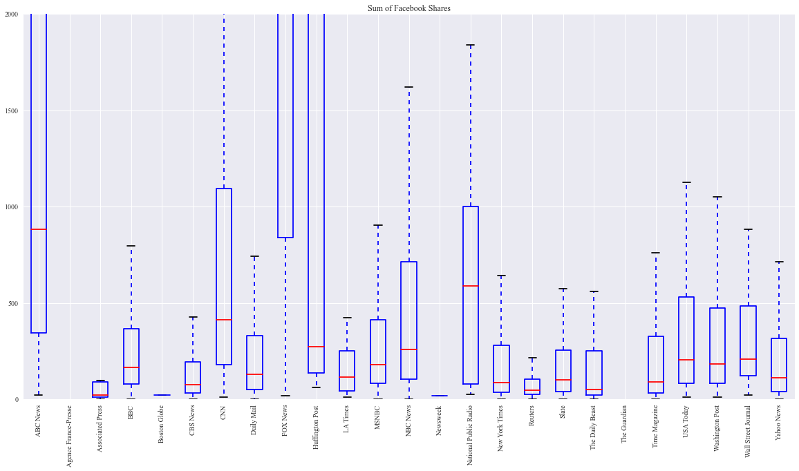
Another interesting layer of information is gleaned by comparing numbers of Facebook link clicks, likes and shares for the stories of the same news providers. An intuitive hypothesis that sharing a story reflects more reader involvement than barely liking it appears to be correct – medians of shares are constantly lower for all providers. Furthermore, the proportion of “sharers” is quite similar in all providers, but the distribution is more varied as judged by the interquartile region. Such results could be explained by a subgroup of readers who regularly read and like the content, but only seldom feel compelled to share a story. Therefore, number of likes could be considered a better measure for regular reader audience, while number of shares possibly reflects the attractiveness of certain stories.
Next we have the Twitter favorites and retweets.
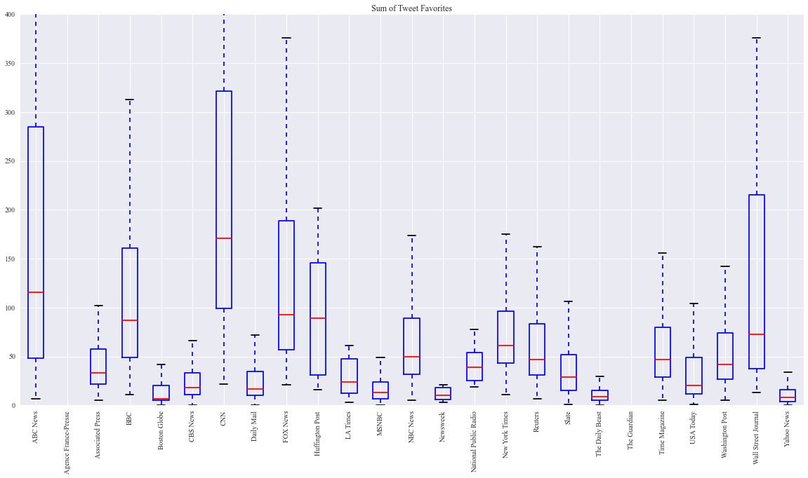
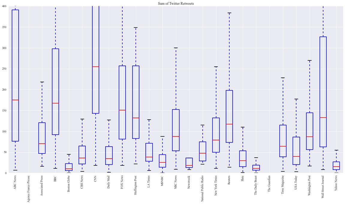
Statistics gathered from Twitter show different story dynamics. Here, number of clicks, favorites and retweets does not follow the same proportion for different providers. For example, consider the statistics for the New York Times, Reuters, and Slate. In number of clicks, Slate is clearly dominant, with median number of clicks approximately equal to the other providers‘ clicks combined, and has a very high third quartile value of 7,000. However, the numbers of retweets and favorites reflect the opposite tendency, with two to four times lower numbers for Slate than for Reuters and the New York Times.
There seems to be some reason that causes users to read, but not share the content from Slate – this might be caused by poor content, misleading headlines or Twitter posts, or some other factor. Furthermore, retweet and favorite statistics on Twitter show additional differences, not revealed by Facebook share-like comparison. Considering the same example, Reuters and New York Times show similar number of tweet favorites, with Reuters even trailing behind, while the number of retweets is around one and a half times larger for Reuters. This could reflect that Reuters gives a lot of attention for the tweets themselves, not only the stories behind them. The same reason could be important in different audience shares of the major organizations: while Fox News shows very high popularity on Facebook and similar Twitter clicks to CNN, the number of retweets and favorites metric is largely in favor of CNN. As the demographics in both websites are very large and varied, it is more likely that the providers invest different amounts of effort and have differing levels of competence in promoting their respective online offerings.
In a similar fashion to statistics relating to Facebook postings, the skewness in tweet popularity distribution caused by several major stories is apparent for every provider. Accurate comparison between different types of organizations (newspaper vs television) at this stage is complicated, due to the extreme differences between the popularity of providers in each group – generally, however, providers with strong roots in TV tend to have high rankings, though the newspaper-based companies (USA Today, Washington Post) are able to maintain a constant audience. This gap is much less pronounced in Twitter than in Facebook, suggesting that the followers on Twitter might be more loyal to their favorite news providers, while Facebook possibly allows for increased spread of the most popular news items.
Dates & Times When do publishers post?
Properly timing posts is an important part of audience engagement. Some publishers hire outside firms to optimize their messaging, and Bitly themselves have published research into how best to time links. This issue turns out to be quite relevant for our predictive analysis as well.
This analysis derives from unstructured analysis currently stored on Github. Interested readers may wish to check it out.
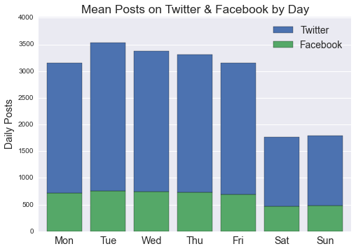
Anyone familiar with working schedules and news cycles can surmise that social media post volume declines over the weekend. This pattern holds for most publishers, though some (the New York Times and the Daily Mail) show little or no dropoff.
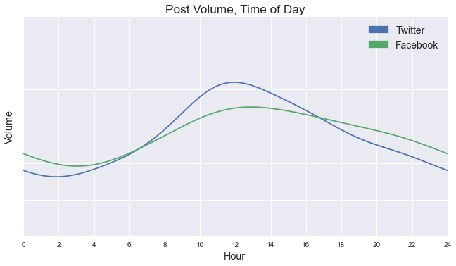
A similarly intuitive pattern holds for posting time throughout the day. Most publishers show a rather rapid “ramp-up” at the start of the workday, and post less as the day (and night) drags on.
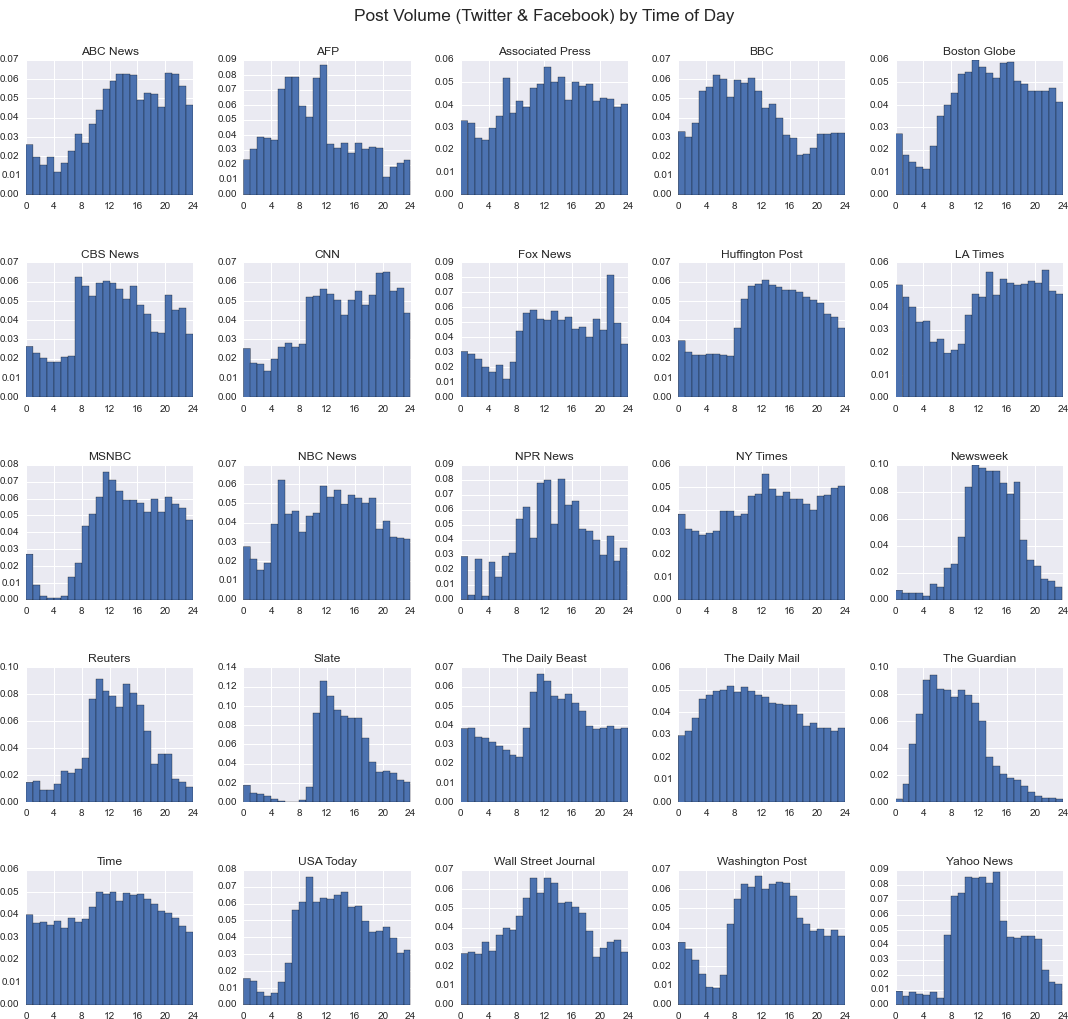
But particular media organizations often post their content at very different times of day. As observed, evenings typically show a decline in post volume—but this may be either gradual (Time) or precipitous (Newsweek). Some publishers follow clearly international schedules that appear lackadaiscal toward cultivating an American audience (Agence France-Presse, The Guardian). There are very few consistent patterns for nighttime posting.
Finally, we performed little investigation of minute-by-minute posting patterns, as the particular minute of a post yielded little predictive power in our regression analysis. But we did note an interesting pattern among Facebook posts. News organizations have a clear habit of posting at the top of each hour and half-hour:
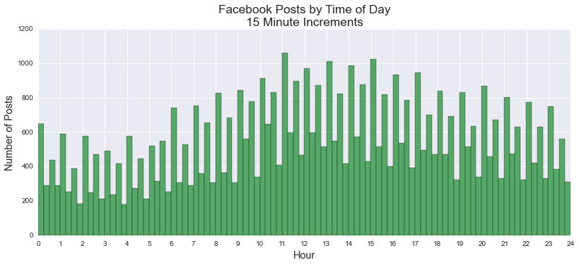
The pattern was stronger among organizations for which we could not ascertain SocialFlow usage (i.e., those organizations that do not direct their links through trib.al), but was still present for both groups.