Key Findings
The clustering analysis finds two main conclusions:
1. Average Social metrics (likes, shares, retweets, favorites) per bitly click (PBC) are different between Facebook and Twitter. From our analysis, Facebook typically has higher average social metrics than Twitter's. We believe that these differences are largely associated with the ability of news organizations to write descriptive posts and to post images and videos with articles which gives readers extra information to decide to "like" an article. This is contrasted to Twitter's 140 character limit and fewer use of photos and videos.
2. Social media clusters of the news organizations, measured via social media metrics and sentiment of posts, do not follow the traditional media categories. Usually, we group the different types of news media into cable, newspaper, online, and etc. From our clustering analysis, we come to show that the traditional division of news organizations based on operational mediums (TVs vs. newspaper vs. digital) does not translate to their online presence. For example, if one believe that because NYTimes and USA Today are newspapers and would share similar online presence, our clustering analysis shows that it is not the case.
To reach the above conclusions, we perform clustering with social media metrics and social media text sentiment scores for each news organization
The code can be found here.
Methodology
The general steps taken to perform the clustering analyses are the following:
1. Calculate social media metrics
2. Standardize the data (by mean and divide by standard deviation)
3. Perform Principal Component Analysis to reduce the data to two components for ease of visualization
4. Perform unsupervised machine learning K Means clustering
5. Use the Elbow Method to determine a reasonable k for the number of clusters
6. Visualize the clusters and interpret results
Clustering on Social Media Metrics
In our analysis, we define several key social media metrics to cluster the 25 news organizations.
Facebook likes per bitly click: this is the quantity of Facebook likes a particular article receives divided by its quantity of bitly link clicks (a measure of site traffic)
We also define the following metrics in a similar fashion.
Facebook shares per bitly click
Twitter retweets per bitly click
Twitter favorites per bitly click
First we calculate the above social media metrics for each of the 23,366 matched articles in our data set. Then we calculate the average the social media metrics for each news organization. We then are able to arrive at a tabular data shown below.
| Twitter favorites per bitly click | Twitter retweets per bitly click | Facebook likes per bitly click | Facebook shares per bitly click | |
|---|---|---|---|---|
| News Organization | ||||
| abcnews | 0.036917 | 0.045097 | 0.773255 | 0.122000 |
| ap | 0.078407 | 0.168253 | 0.345063 | 0.124737 |
| bbc | 0.124507 | 0.229443 | 1.674218 | 0.226618 |
| bostonglobe | 0.085831 | 0.090406 | 0.440436 | 0.060554 |
| cbsnews | 0.091343 | 0.160942 | 0.663655 | 0.125372 |
| cnn | 0.117169 | 0.161787 | 0.743328 | 0.146012 |
| dailymail | 0.085926 | 0.138044 | 0.305375 | 0.083642 |
| foxnews | 0.083563 | 0.094659 | 2.710953 | 0.661291 |
| huffingtonpost | 0.080466 | 0.083731 | 1.390209 | 1.150219 |
| latimes | 0.140971 | 0.265342 | 1.561624 | 0.268176 |
| msnbc | 0.174279 | 0.291534 | 1.811349 | 0.238096 |
| nbcnews | 0.119766 | 0.177036 | 0.542406 | 0.096529 |
| newsweek | 0.120774 | 0.224866 | 0.372624 | 0.113102 |
| npr | 0.104915 | 0.129121 | 1.342415 | 0.244134 |
| nytimes | 0.091615 | 0.113453 | 0.351794 | 0.061440 |
| reuters | 0.094633 | 0.218980 | 0.477018 | 0.109050 |
| slate | 0.038988 | 0.044366 | 0.066797 | 0.025272 |
| thedailybeast | 0.061600 | 0.084940 | 0.313304 | 0.071559 |
| time | 0.099225 | 0.145994 | 0.528061 | 0.069238 |
| usatoday | 0.088918 | 0.140451 | 2.341251 | 0.394116 |
| washingtonpost | 0.087305 | 0.170458 | 0.280762 | 0.083621 |
| wsj | 0.126071 | 0.223185 | 0.869757 | 0.321035 |
| yahoonews | 0.144062 | 0.240997 | 1.328506 | 0.158942 |
Next, we use the Elbow Method to arrive at a reasonable k for the clustering algorithm.
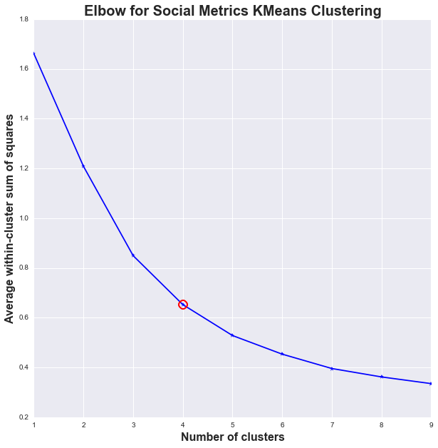
From the graph above, a reasonable k for the average social metrics per bitly click data will be k = 4. The Elbow Method's* premise is that if the marginal improvement in variations explained starts to decrease as we add in more clusters, we would have arrived at a somewhat optimal k. This is very similar to the F-test where if the variations explained by a newly added set of predictors doesn't decrease the sum of squares much, we would not reject the null hypothesis. From this phenomenon, the optimal K can be spotted at the "elbow" of the graph as shown above.
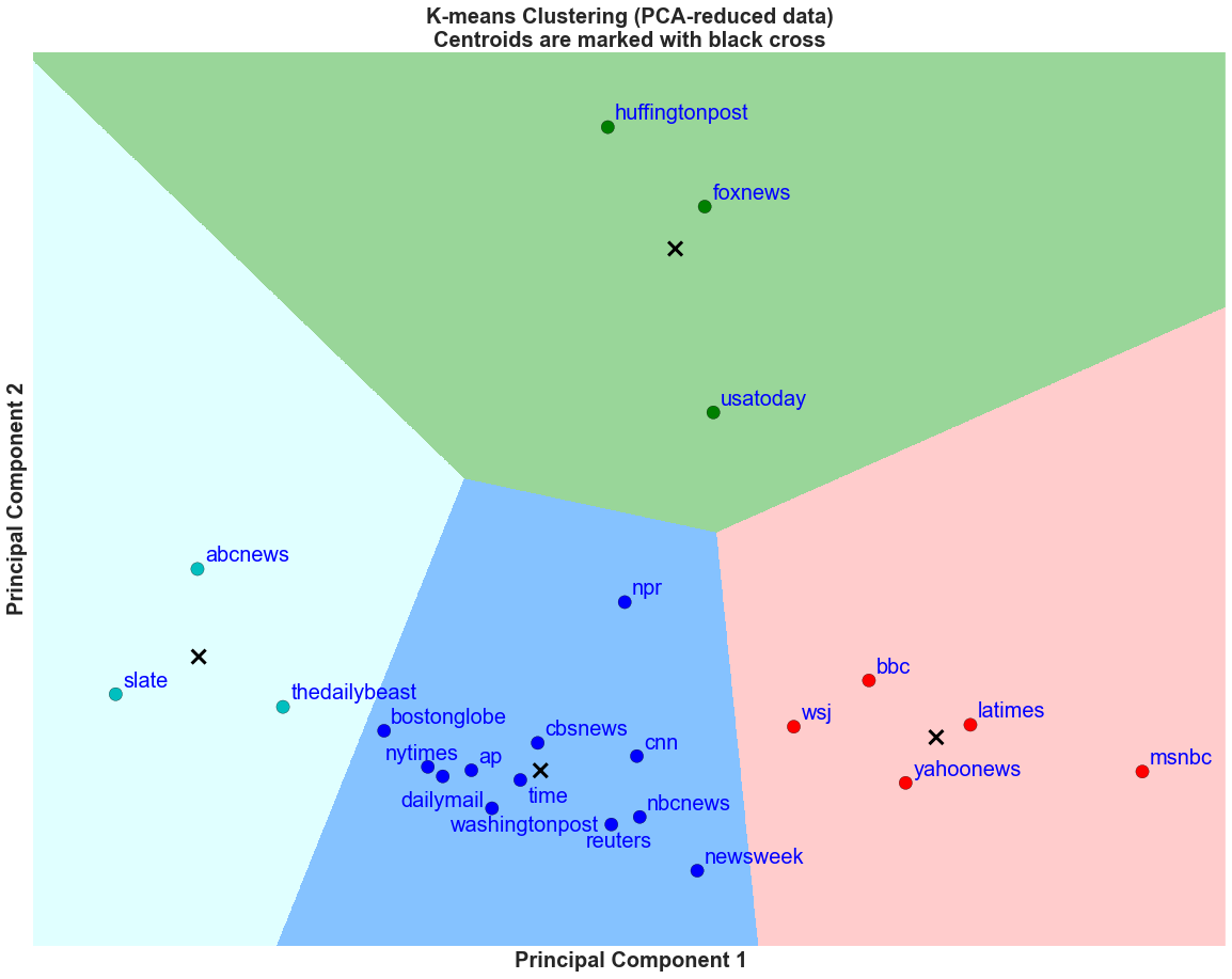
Having chosen k = 4 for our number of clusters, we can now plot the clusters and their corresponding cluster boundaries.
Discussion
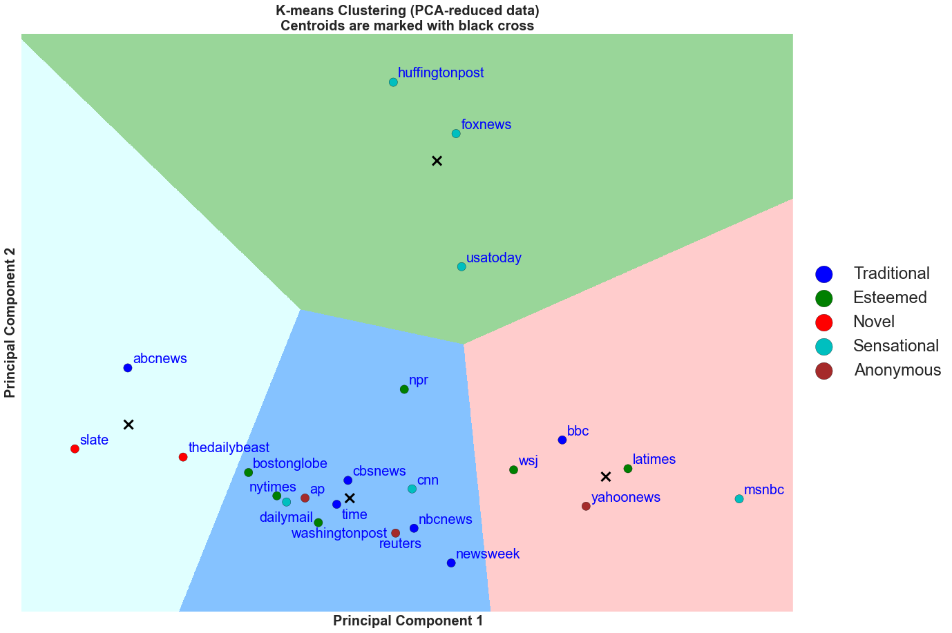
From the elbow method, we saw that a reasonable k for this particular k means cluster is k = 4. After performing the clustering, we plot the 4 decision boundaries and see that there are four distinct groups out of the 23 news organizations.
The green group comprises of Huffington Post, USA Today, and Fox News. These news organizations tend have high social metric per bitly click* for Facebook likes and shares, and around average Twitter retweets and favorites per bitly link click. It is interesting to note that the three news organizations have Facebook social metrics per bitly link click to be greater than 1. This suggests that readers are not reading the full article and are liking the viral content based on headlines, images, or videos on the social media.
Below, we give an example from Fox News where the like per bitly link click is greater than 1. This is juxtaposed to New York Times where it has an average of 0.35 likes per bitly click and 0.06 shares per bitly click. We believe this occurs because New York Times articles are typically complex and is more conducive for a reader to actually click on the link to read. While, Fox News and Huffington Post usually run pieces that more sensational in nature and readers would click the 'like' button even if they did not read the article itself.
The red group comprises of news organizations that have high Facebook likes per bitly click, and high Twitter retweets and favorites per bitly click. This group includes BBC, Wall Street Journal, Yahoo News, LA Times, and msnbc.
The teal group is composed of news organizations that are lower on the Twitter retweets and favorites per bitly click. These organizations are the opposite of the red group. This group is formed by Slate, The Daily Beast, and ABC News.
Lastly, the blue group is made of the remaining news organizations. These organizations are average in their Twitter social metrics per bitly click and have average or below average Facebook social metrics per bitly click.
From the grouping, it is possible to deduce that generally, the higher the value of Principal Component 2 (PC2), the higher the Facebook social likes and shares per bitly click are. Thus, the green group has the highest Facebook social likes and shares per bitly click in the 23 news organizations shown here. For example, Huffington Post has the highest average Facebook shares per bitly click at 1.15 shares per bitly click and USA Today has the highest average Facebook likes per bitly click at 2.34 shares per bitly click.
In addition, it is also possible to deduce that the higher the value of Principal Component 1 (PC1), the higher the Twitter social metrics per bitly click are. For example, msnbc has the highest Twitter retweets and favorites per bitly click and has the highest PC1 value.
Note*: Social metric per bitly click (PBC) is defined as the social metric (likes, retweet, etc)/bitly click. For example, a Facebook post with 1,000 likes with 2,000 bitly clicks (proxy for webpage views) will have a Facebook likes per bitly click of 1,000/2,000 = 0.5 likes per bitly click.
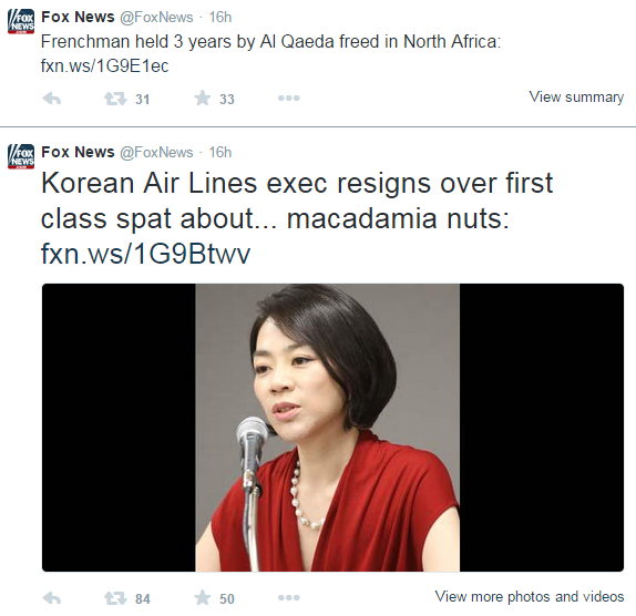
Fox News, New York Times Facebook and Twitter Examples

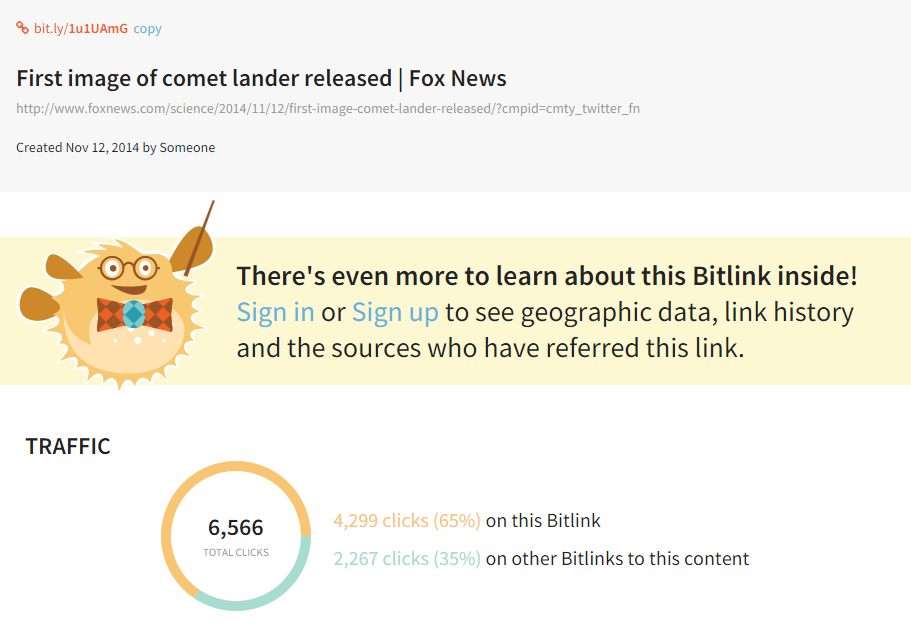
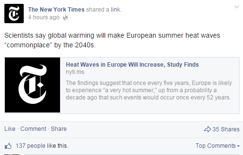
The images above show a Fox News article where the Facebook likes = 16,956, and bitly total clicks = 4,299. This gives a likes PBC at 16,956/4,299 = 3.94. This is an example where the number of likes is greater than bitly clicks and the post is accompanied with descriptions as well as a video. We believe that viewers have enough information to make up their minds to like the post with just the comments, description, and video. This is different from NYTimes articles where there is usually just an image accompanied with the description as seen before.
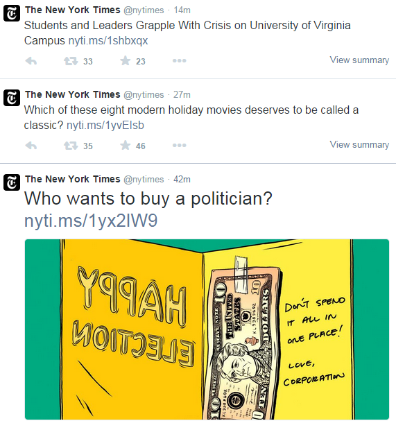
Another interesting difference between Facebook and Twitter is that Twitter has a 140 character limit and Twitter posts are usually not accompanied with images and rarely have videos. Here are some examples below to illustrate the point.
Discussion
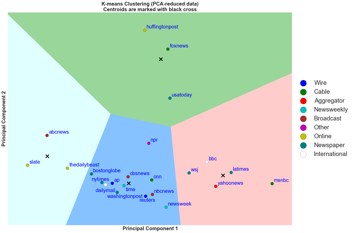
The above figure is another perspective of the K Means clusters. The decision boundaries of the 4 clusters from the original K Means are preserved here. However, in this figure, each marker, denoting each news organization, is now colored by the our subjective categorization of the media industry. Note that, we came up with this categorization before we ran this particular clustering analysis.
Using our subjective categorization in our analysis, we come up with some interesting results. From the above plot, we can see that within the green decision boundary, all of the news organizations are ones that are known to be sensational. This group is associated with high Facebook likes and shares per bitly click (PBC). Similarly, msnbc has strong Twitter retweets and favorites PBC and it is an outlier in the red group.
Surprisingly, there are two sensational news organizations (CNN, Daily Mail) that are in the blue group with average mean Twitter and Facebook PCB. We suspect that although both are sensational, CNN and Daily Mail are both international news organizations and, therefore, do not publish content similar to Huffington Post or USA Today. Therefore, they would have different social metrics and are thus found in the blue decision boundary.
In addition, somewhat surprising is that the red Novel or Digital media organizations such as Slate and The Daily Beast are found in the teal decision boundary where the groups have lower Twitter social metrics PBC. This is some what surprising since one would expect the novel digital media companies to have a strong social presence and, in turn, to have strong social metrics PBC.
Another interesting observation is that most of the Traditional and Esteemed news organizations are found in blue and red decision boundaries. This means that these organizations tend to do well on the Twitter social metrics but not as well as Huffington Post on Facebook social metrics.
Note: Novel points to digital media. Anonymous points to wire and aggregator media.
Discussion
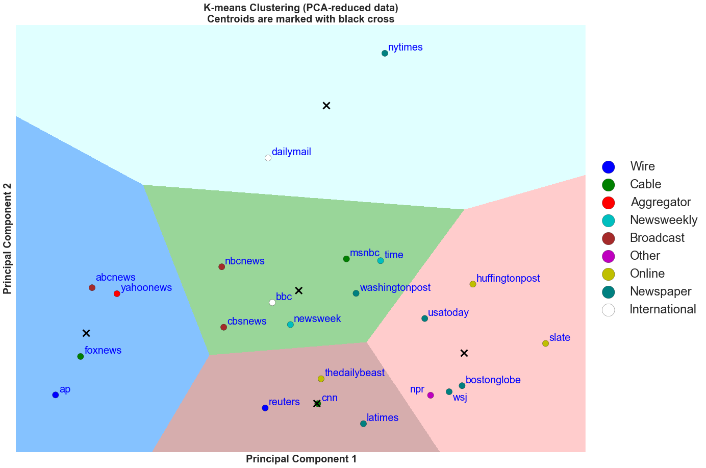
The plot above is the 3rd perspective of the same K Means clustering result. This time, we color each marker with the organization's type of media. We can derive much of the same insights as the above two figures. In addition, it can be seen in the figure that even within cable media, the social metrics per bitly click is very different (CNN vs. Fox News vs. msnbc). Moreover, we can also see this for newspaper (USA Today vs. NYTimes vs. LA Times). Lastly, it is interesting to see that all of the online media are in teal cluster boundary and all of the newsweekly are in the blue cluster boundary. Therefore, the traditional categorization of news organizations do not necessarily apply to their online social presence as seen in the clustering analysis.
Social Metrics Clustering Summary
From the above three figures, it is possible to conclude that:
1. Social metrics per bitly click (PBC) are different between Facebook and Twitter.
We can see that the average social metrics PBC for Twitter is on average lower than the average social metrics PBC for Facebook. In essence, it is more likely that articles posted on Facebook become "popular" and attain many likes and shares without readers actually reading the articles. We believe that this occurs because Twitter has a limit of 140 characters and tweets are not as often associated with images. Therefore, on Twitter, it is more conducive for readers to click on the link and view the article on the news organization's website because there is just not enough information for the readers to retweet or favorite the article without gaining more information in the form of reading the article. While on Facebook, article posts are often associated with images, lengthier descriptions, and even videos. Therefore, readers are often presented with more information and have less barrier to make up their mind to like or share an article.
2. Social media presence of the news organizations is different from the traditional categorization of media types:
Usually, we group the different types of news media into cable, newspaper, online, and etc. From our clustering analysis, we come to show that the traditional divide of news organizations based on operational mediums (TVs vs. newspaper vs. digital) would not translate to their online presence. For example, if one believe that because NYTimes and USA Today are newspapers and would share similar online presence, our clustering analysis would show that it is not the case. We believe that the news organization's online social metrics are not divided on the traditional categorization based on the medium, but rather are strongly associated with how the news organizations are posting the articles with descriptions, images, and videos. Moreover, the metrics are also associated with the article contents where sensational pieces tend to receive strong social metrics PBC.
Clustering on Sentiment
Another insightful extension that we can use clustering for is to analyse the relationships of sentiment of the news organization's social media posts. For this analysis, we will use the sentiment scores is detailed in the Natural Language Processing section.
We define the Average Proportion of Positive, Negative, or Neutral as the following: Average Proportion of Positive articles on Twitter for NYTimes = number of articles classified as Positive/number of articles posted on NYTime's Twitter handle.
Again, we use the Elbow Method to arrive at a reasonable k for the clustering algorithm.
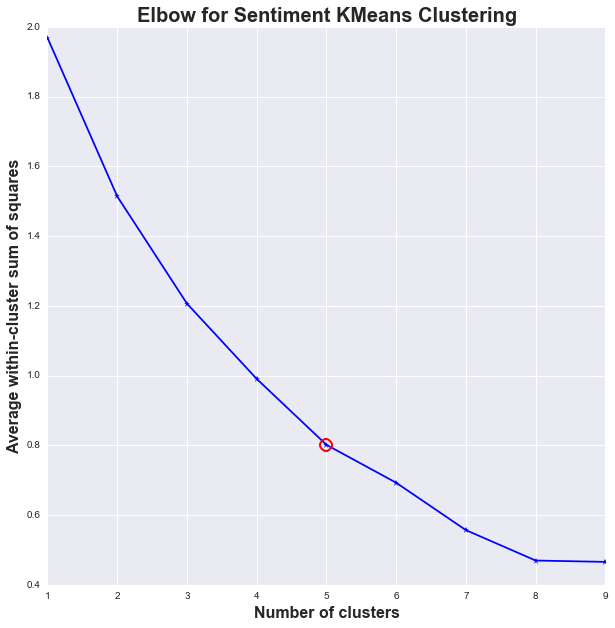
From the graph above, a reasonable k for the average Twitter and Facebook text sentiment data will be k = 5.
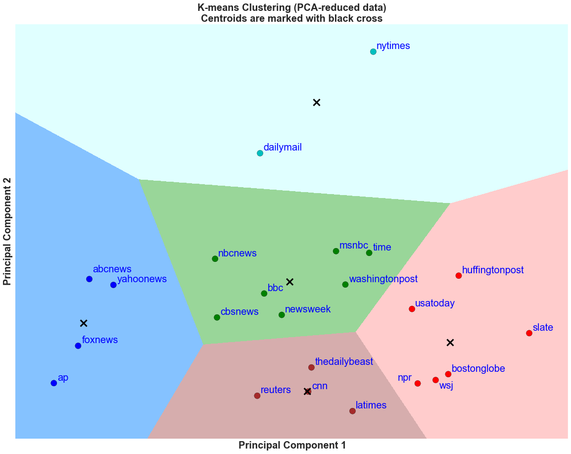
Discussion
From the elbow method, we saw that a reasonable k for this particular k means cluster is k = 5. After performing the clustering, we plot the 5 cluster boundaries and see that there are 5 distinct groups out of the 23 news organizations.
From the grouping, it is possible to deduce that generally, the higher the value of Principal Component 2 (PC2), the higher the average proportion of article posts on both Twitter and Facebook are classified as neutral. In addition, it is also possible to deduce that the higher the value of Principal Component 1 (PC1), the higher the average proportion of article posts on Twitter are classified as positive.
From the figure above, we see that Daily Mail and NYTimes are grouped together. This is similar to the first social metrics clustering analysis. These two news organizations are known to be competitors within the industry and it is fascinating to see how sometimes competitors mirror each other in many aspects (content and how the content is received as measured with social metrics). In addition, NYTimes is known to be more unbiased than other media outlets and it is great that the sentiment analysis picked this up in how NYTimes choice of words in headlines and article descriptions tend to lack strong emotional words.
This is contrasted by the blue, teal, and red groups where the proportion of neutral posts are much lower and they use either more negative/positive words in their descriptions and tweets. Notable news organizations are Fox News, CNN, LA Times, Slate, and Huffington Post.
Note*: Average Proportion of Positive, Negative, or Neutral are defined as the following: Average Proportion of Positive articles on Twitter for NYTimes = number of articles classified as Positive/number of articles posted on NYTime's Twitter handle.
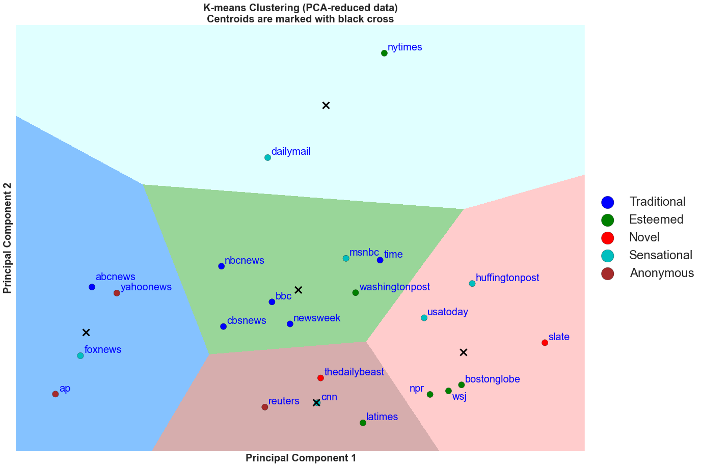
Discussion
We perform a similar classification as we have seen in the social media metrics clustering plot. Here, we can see that most of the traditional media are in the green cluster boundary except for ABC News. Thus, they are in around the mean in average proportion of positive posts and neutral posts.
Sentiments Clustering Summary
From the above three figures, it is possible to conclude that: NYTimes and The Daily Mail are by far have the most emotionally neutral headlines and descriptions in their Facebook post descriptions and Twitter tweets. In addition, we find that the blue, brown, and red cluster boundaries are associated with more emotional post descriptions and tweets. Within these groups, we find the news organizations that are typically associated with emotional headlines such as Fox News, Huffington Post, USA Today, and CNN. However, we also, find some surprising results in that Associated Press, Reuters, and Wall Street Journal belong in these clusters. Perhaps, the contents of these news organizations are known to be neutral or unbiased, but the way the contents are broadcasted might not be. Lastly, we observe that Wall Street Journal and Fox News are on the opposite ends of the clustering. This is particularly interesting as the news organizations are owned by the same owner and have similar leanings in ideology. We expected them to be clustered close to each other. Again, this might be explained by how the contents are broadcasted through social media posts.